Let there be light

It is the light of the sun that allows us to live here on earth. At the same time, it determines how we see the world around us. Artists use the life-giving aspect of light symbolically in their work. Most of all, though, they employ light effects in different ways to give shape to figures, landscapes and objects. How do they go about it? We dipped into our collection to pick out some illuminating examples.
1. Powerful contrasts
When Jacob Jordaens painted this Adoration in 1616–17, the chiaroscuro – light and shade – technique was at the height of its popularity. Here’s a quick guide on how to paint this way: 1. Imagine a single, very bright light source in the foreground to illuminate your scene. It doesn’t necessarily have to be in the picture. In this example, the Baby Jesus himself seems to be the source of light – very appropriate for the person who is ‘the light and the way’ in Christian symbolism. 2. Your background, meanwhile, needs to be very dark, so that the light in the foreground creates a ghostly effect. Deep shadows are a side-effect of the technique. It also lends the human figures more three-dimensional forms.
In short, ratchet up the light effects to make them stronger than they would be in reality. The lighting can then heighten the message of the painting. They loved this kind of theatricality in the Baroque era!
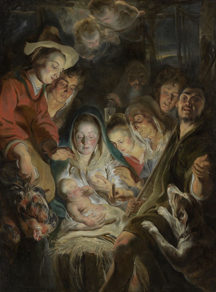
Adoration of the Shepherds, - Jacob Jordaens I
2. Winter light
Belgians like to travel to places where the sun always shines. Whether on vacation, or as artists looking to paint the ‘southern light’. And people from Spain or Italy are occasionally envious of our grey light too. The soft, diffuse light of a sky full of rainclouds. Or the special way the sun reflects off thick snow, making it almost luminous. In this 1928 landscape, Valerius De Saedeleer captures the last glow of the setting sun and spreads it gently across the blanket of snow. The silence of nature in winter holds sway.
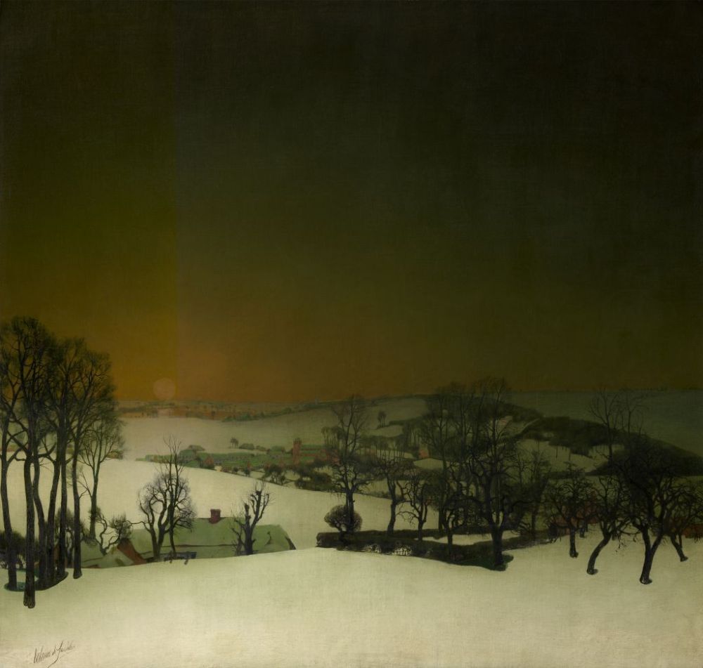
Snow in Flanders - Valerius De Saedeleer
3. Divine light
James Ensor said that light was his ‘daughter’. He expressed his love for her in grand style in this canvas, which measures 2 x 2.45 metres. Ensor began work on it in April 1887, but did not know immediately what path to follow. He wrote to friends: ‘How the painting will end up, I don’t know. I am satisfied with the sky, which sparkles.’ Ensor applied the colours and techniques of the Impressionists, whose work he had finally seen in person a little while earlier. It made him realize that he wanted to do something different and he went on to pursue a path that was entirely his own. This colourful light spectacle was Ensor’s first achievement in this respect. The divine light of an angry God dominates the painting. We have to look hard to spot Adam and Eve, who are secondary details. Conservation treatment has revealed other figures in the work too, including mammoths and an angel with a flaming sword. It’s amazing what light can do when it comes to stimulating someone’s unbridled imagination…
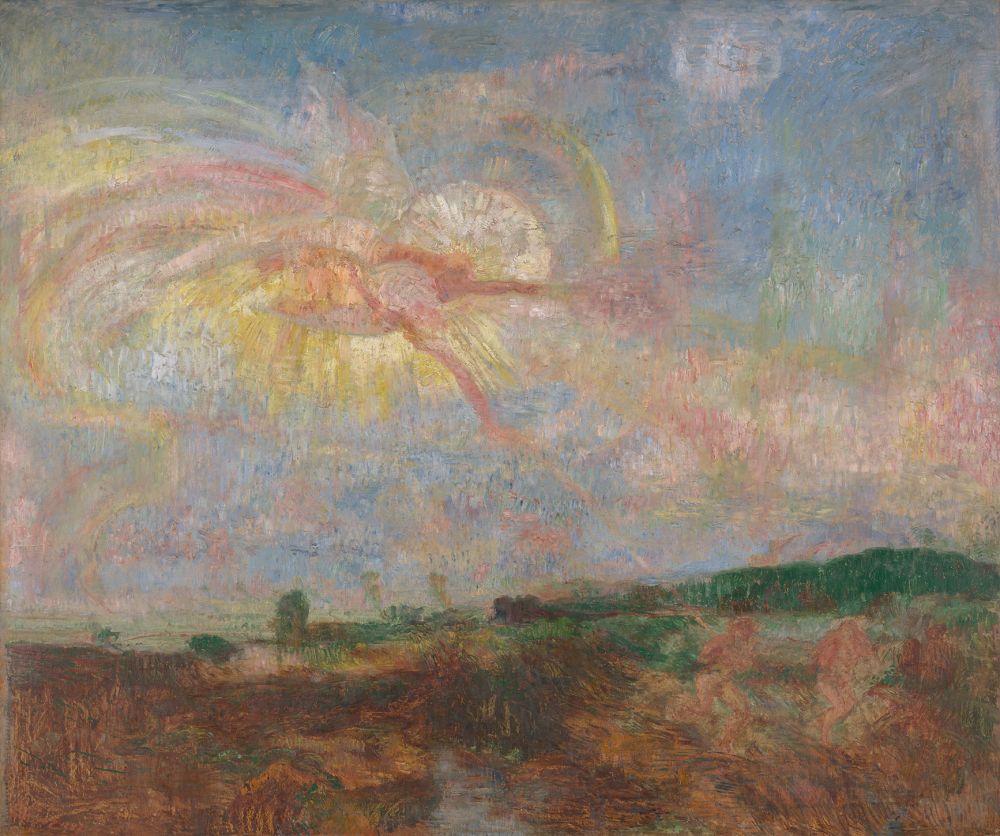
Adam and Eve Expelled from Paradise - James Ensor
4. Electric light
Jules Schmalzigaug had already been living in Venice for a while when he returned to Antwerp in 1912 to visit his family at Christmas. While there, he took the opportunity to drop into his colleague Jakob Smits’ studio in Mol. Back in Italy, Schmalzigaug set up his studio in the same way as Smits, with mirrors, drapes and shutters to filter and reflect the incoming light. Schmalzigaug had literally seen the light. He now began to produce entirely Futurist work like this one, in which electric light pops out from the canvas like dazzlingly coloured fireworks. An ode to a new form of light and to progress.
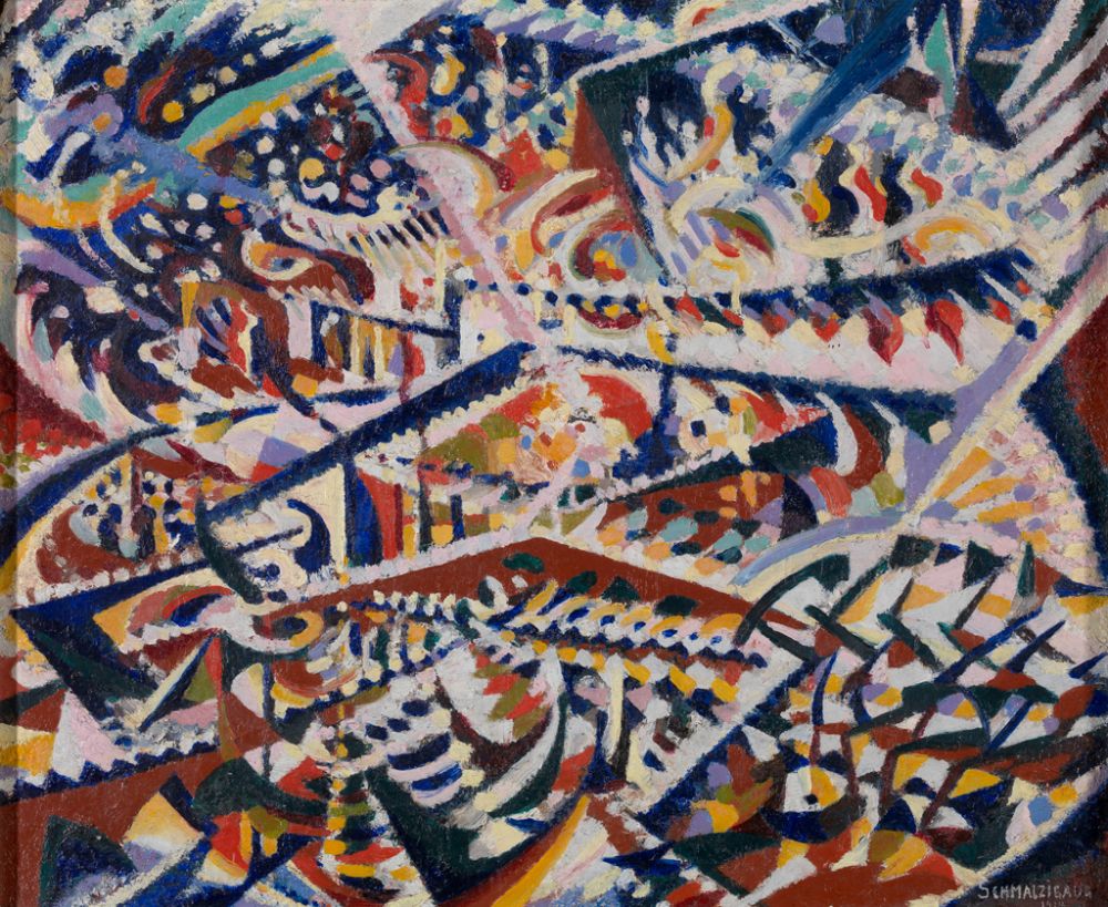
Light + Mirrors and Crowds: Interior of a Popular Dancehall in Antwerp - Jules Schmalzigaug
5. Reflection
Sixteenth-century Antwerp was one of Europe’s most important port cities. Archaeological finds – including costly glassware – testify to the wealth of its population at the time. The island of Murano near Venice was the European centre of glass production in the 13th century. Its glassblowers first developed the clear, transparent product known as cristallo in 1453. By the 16th century, the technique had been refined to such a degree that makers could finish their glassware with intricate decorations and shapes. A new trend was born. But not all the crystal glass found in the Antwerp soil turns out to be Venetian. Savvy entrepreneurs also began to make glass of their own, including crystal à la façon-de-Venise (‘Venice-style’). Is the glass in this painting by the Antwerp artist Osias Beert (1580–1623) Venetian or Antwerp-made? It’s hard to tell. Especially when it is chiefly picked out by its reflections. In daylight, in this instance, but above all after dark. At a time when candles were expensive, reflections in glasses, mirrors and gold surfaces offered an extra source of diffuse candlelight. After all, you had to see what was on your plate...
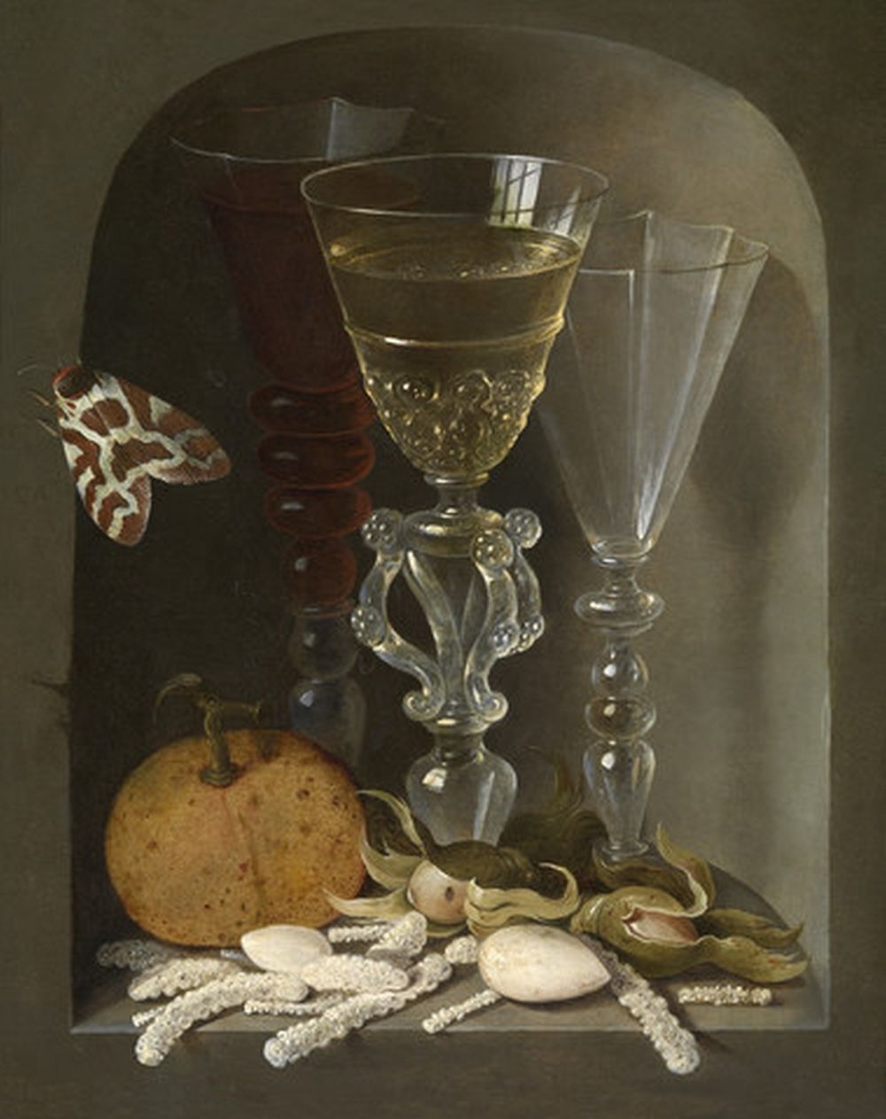
Still Life with Three Wine Glasses in a Niche - Osias Beert
6. Warm light
This is warm light. Literally so, since Otto Piene used fire to make this painting. He set fire to thin layers of combustible material and then manipulated the direction of the flames by holding the corners of the canvas. He painted a fiery-red surface around the blackened form that resulted. Combined with the white centre point, Piene seems to say that the purifying fire is clearing the way to the bright white light.
The artist wrote in 1958: ‘Light is the most important requirement for everything that is visible. Light is the colour circle. Light is the life-substance both of men and of painting [...] Through pure light, painting will be able to evoke pure feelings.’
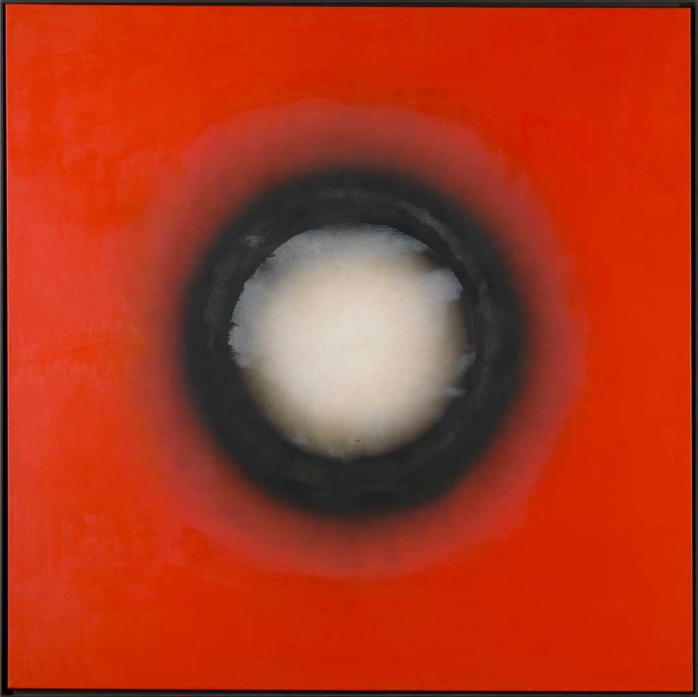
Great Sun - Otto Piene
7. Luminosity
7. Luminosity
This painting radiates the warmth of the summer sun at its zenith. Emile Claus himself was at the zenith of his powers when he created it in 1893. He was the figurehead of ‘Luminism’, the Belgian variant of Impressionism. Claus was a great admirer of the French Impressionist Claude Monet, who worked directly on the white canvas with intense, unblended colours. The result was a maximum, luminous effect. Claus took it a step further in Summer, which is all summery light and warmth. By alternating smooth and thick brushstrokes, he made the light truly vibrate through its multifarious reflections. The artist always worked outside and seems literally to have been dazzled here as he painted. ‘Luminism’ took its name from the Latin root lumus, meaning ‘light’.
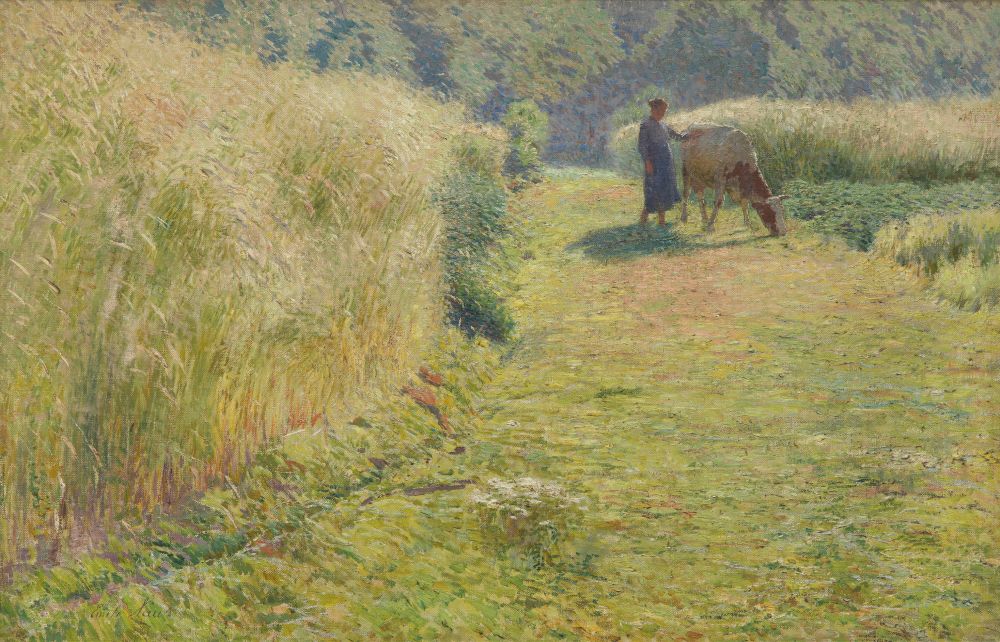
Summer - Emile Claus
8. The cool light of the moon
Paul Delvaux’s Pink Bows is the polar opposite of Claus’ Summer. His meticulously painted women descend from the mountain and walk along a kind of catwalk, which cuts the city of classical ruins in half. Despite the nocturnal darkness and the absence of any visible light source, we clearly make out the women and their uncanny surroundings. As if the full moon were illuminating everything frontally. Long shadows are cast, suggesting the intensity of the light – light that is powerful yet cool, which is why there are no bright colours. Paul Delvaux had a thing for night-time. Many of his paintings feature nocturnal scenes. The darkness makes the world that he presented time and again even stranger.
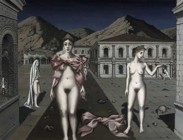
Pink Bows - Paul Delvaux


